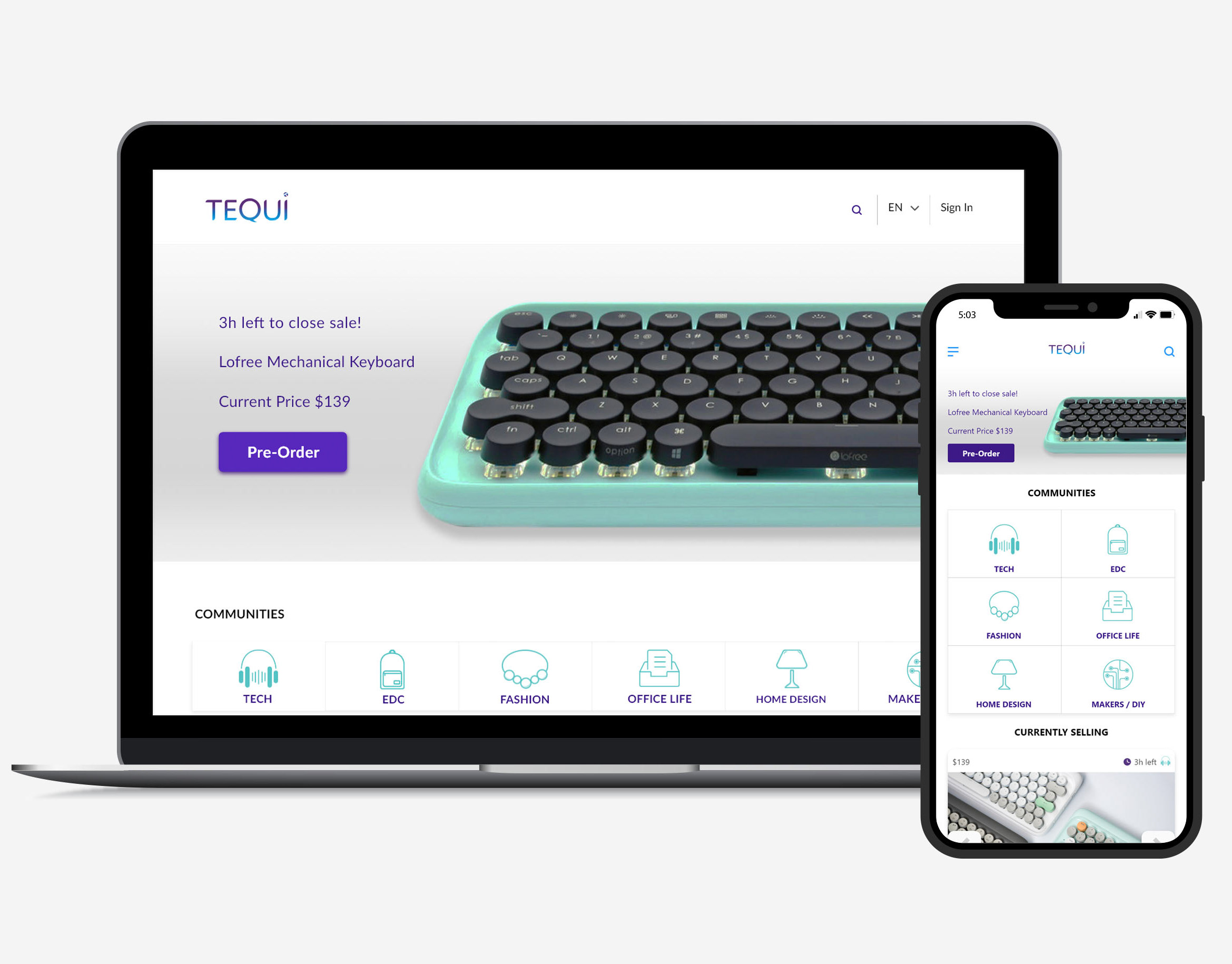
Alpha ecommerce website
Alpha is an e-commerce site specializing in language-learning products. The goal was to provide a platform to display high-quality, professionally tested products and generate a community between experts and customers.
I worked closed with a Project manager and designers to define core guiding principles that represented 3 months researching about user context, making surveys, sketching, prototyping and testing until the final design. Working closely with a developer to ensure that every spec of the project would be executable.
I worked closed with a Project manager and designers to define core guiding principles that represented 3 months researching about user context, making surveys, sketching, prototyping and testing until the final design. Working closely with a developer to ensure that every spec of the project would be executable.
A bit of Context
The internet allows us to connect with people from all over the world, America is growing more and more diverse, and we see an increasing number of children who do not speak the native language of their parents’ culture.
Starting Point
Our target demographic middle- to upper class parents, as well as teachers of both low- and high-income schools took us to visit 2 schools in the area, where we had the opportunity to interview our primary users, teachers and parents to hear about their struggles finding games and reliable tools that help children learn a new language. This helped us to create our main personas and prioritize important features that users require.
Primary Goals
• Provide a platform of the best usability to find language educational products and tools.
• Create a platform to display high-quality, professionally tested products.
• Generate interest in the website and sales of educational toys.
• Generate a community between experts and customers to provide reliable information that supports quality of the product.
• The website should load quickly and help people perform a variety of key actions quickly.
Use model
Wireframes & Sketches
I started to explore solution of the main features of the site, starting with home page, search filters and product page.
Heuristics Evaluation
To start testing the site usability I applied an heuristic evaluation with multiple user.
Results:
• Make visible the numbers of items added to cart
• Add a + icon to display options instead of displaying info by placing over the question mark
• Add a more visible and easily accessible blog link


